 by
by If you think the Pantone Fashion Color Trend Report for the next installment of New York Fashion Week is based on one trend, think again.
Diversity, Barbiecore, the pandemic shutdown, interstellar imagery and our deeper connection to nature came into play. Separating the top 10 color palettes and the five Core Classics, Leatrice Eiseman, executive director of the Pantone Color Institute, explained the practicality and implications of the roster.
More from WWD
One of the lasting effects of the pandemic is a slower pace of fashion trends, in part because people are getting used to shopping less and dipping into their closets more, according to Eiseman. Priorities have changed and identity are factors. “But that doesn’t mean there isn’t room for a newcomer. That’s what attracts the human eye. This does not mean that trends will go away forever,” she said.
However, many shoppers tend to mix new finds with something they already own. “The other practical aspect for a lot of people is, ‘What will it cost?’ If they have something that’s practically good, they just want to improve it and make it more fun,” Eiseman said. “It’s definitely less about following a fashion rule book and more creative.”
All this is not to say that the fall 2024 palette is “uninspiring,” Eiseman cautioned. “It’s always about how you can put them together.”
Some of the top 10 might look sober compared to the vibrant colors that have been splashed all over social media and on some runways in recent seasons. Is this the answer to Barbiecore? Eiseman thinks so, explaining that there is now a return to colors that are rich and warm innately with an elegant feel. “In my classes, I call it ‘homeostasis’. It is bringing balance to your colors and the seasons. If the previous season was really bright and you open your closet, you might think you need something to tone everything down. We don’t often relay that in words, but we feel it intellectually.”
Another subliminal factor that influences fall color choices is the interstellar images we’ve seen from the James Webb Space Telescope. Along with that is “Moonstruck,” a shadowy, mysterious gray “that just lies out there in the atmosphere that looks amazing with every color you put next to it,” Eiseman said. Ditto for Italian plum, Red Orange and Winter Sky.
Along with images from outer space, there are other determinants of changing winds in the world of art, and there are always socio-economic forces to consider, as well as “generally what is happening in the world around us. And we keep our ears and eyes open to the consumer zeitgeist. Part of what we do in forecasting is to consider, ‘What brings us to this point?’ And we try to look into the psyche of the designers as well. When we see their collections, we wonder what might be going through their minds choosing colors,” said Eiseman. “Obviously, we can’t think for them. But many creative people, especially in the field of design, have a second sense.”
On another level, by having two brown versions – Raw Umber and Buckthorn Brown – hints are given to the ongoing discussion about diversity. “That’s certainly a surprising bet. Perhaps it is not expressed in so many words. There is much more understanding of the variations of brown tones and brown skins. We certainly see that in the cosmetics industry, and in the fashion industry. This has an impact on many other areas such as advertising. Now your eyes are open to all the brown variations. We’re seeing a lot more diversity: in print, online, fashion, art, product design and anywhere else where color applies,” Eiseman said. “I think diversity has a lot to do with that.”
New York Fashion Week Fall 2024 Color Palette
Tomato Cream 16-1348: The name alone is familiar and delicious to many outside of the can-loving Campbell Soup cooks, but this shade has delicious, nutritious undertones. John Galliano’s Maison Margiela served Tomato Cream in strong styles, and Christian Siriano hinted at it in an inspirational sketch for fall 2024. Compared to all the other colors, this warm shade is “the best for fall, because you want to rub yourself in it,” Eiseman said.
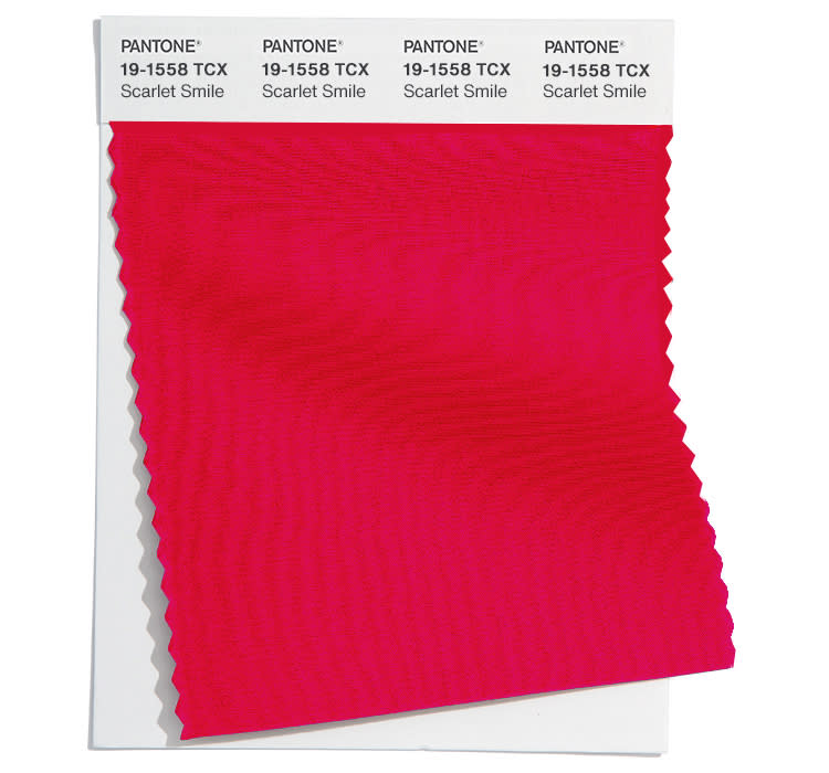
Scarlet Smile 19-1558: Paging Taylor Swift: Scarlet Smile sounds like it is customized for the megastar, whose signature red lipstick is heavy and possible when cheering on the Kansas City Chiefs and her man Travis Kelce. Determining the exact shade is now a science and Nars’ Ruby Woo Mac and Velvet Matte in Dragon Girl are part of the Grammy winner’s makeup arsenal. Another fan favorite, Brittany Mahomes, donned a Scarlet Smile bikini for Sports Illustrated’s 60th anniversary swimsuit issue. “If you’ve been practical and you keep what you’ve got, psychologically there’s nothing like red to give you that shot of adrenalin. It’s the first color many people think of when they add something to their wardrobe,” Eiseman said.
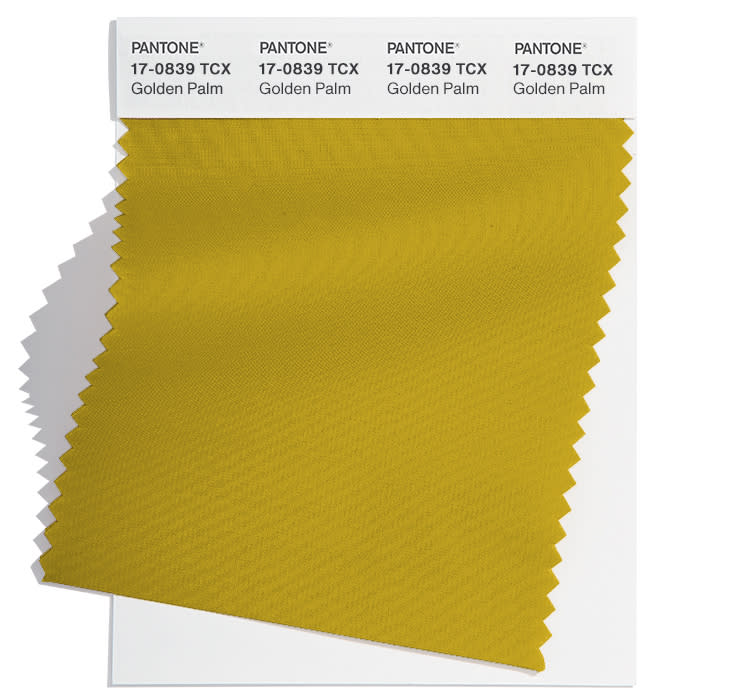
Golden Palm 17-0839 TCX: The Golden Palm mixes an eco-inspired like a tree in the forest with the green in the color description, whether it’s Aventurine or a deeper Fern. Not a dull yellow green, the Golden Palm has an earthy warmth that makes it quite familiar. Designer Adam Lippes appeared at the Veronica Beard party in Los Angeles in this week’s Golden Palm-trimmed ensemble.
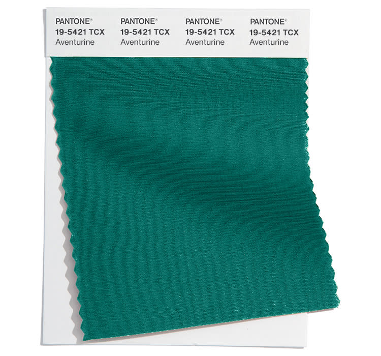
Alien 19-5421: Somewhere near teal and turquoise, Aventurine is a mineral-based tone that conveys richness. It complements the toasty tones and reds on the roster.
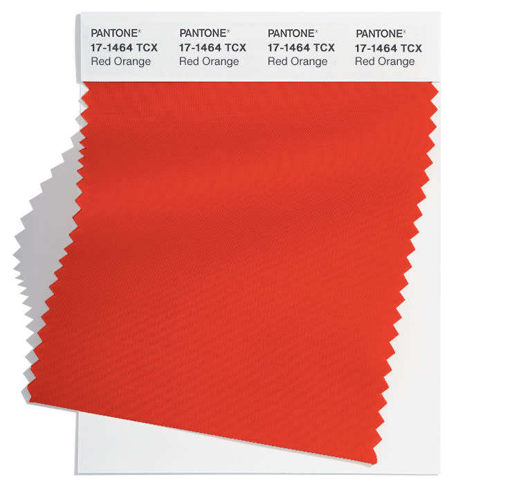
Orange Red 17-1464: Edged in red and orange, this vibrant shade is a reflection of how reds are more about warmth than coolness. NFL fans could argue that Red Orange is more central in the uniforms of the Kansas City Chiefs and they have millions to make that argument with Super Bowl LVIII two days away in Las Vegas. And there are more Chiefs fans than ever, considering the team’s social media base grew nearly 7 percent to 550,000 by October.
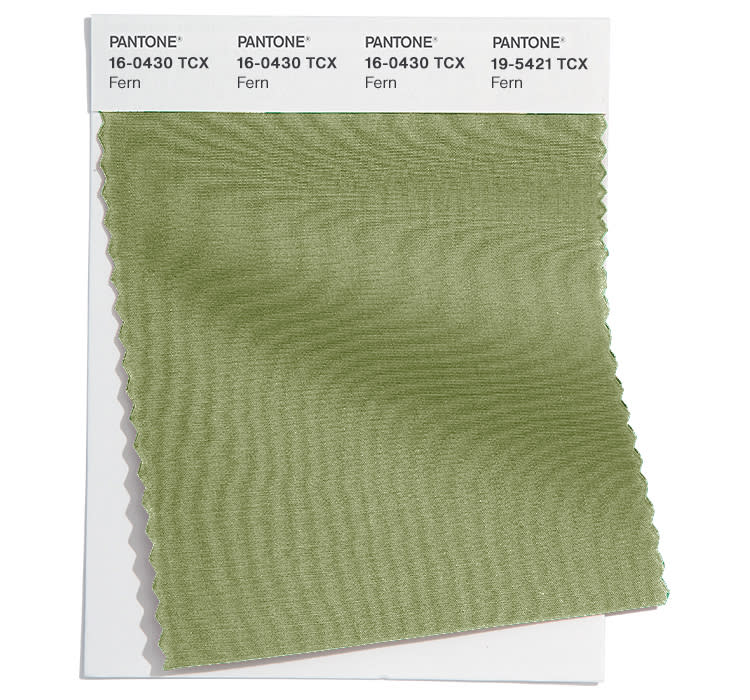
Fern 16-0430: As greens have grown to become more mainstream in the fashion color wheelhouse, they have achieved neutral status, as they pretty much work with anything. “This leafy green works so well with half the colors in the palette,” Eiseman said.

Italian Plum 19-2514: However, if this name is invited, the Italian Plum might not stand out at first glance as neutral. But this dark purple offers versatility just as aubergine and deep grape do, when combined with other colors, Eiseman said.
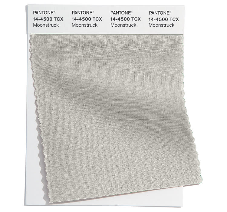
Hit the Moon 14-4500: Shadowy gray has enough presence to be in the top 10 instead of being grouped with the Core Classics as a sign of the staying power of the grays. AZ Factory and Zuhair Murad infused Moonstruck into their couture collections, while Remain used it for evening wear at Copenhagen Fashion Week.
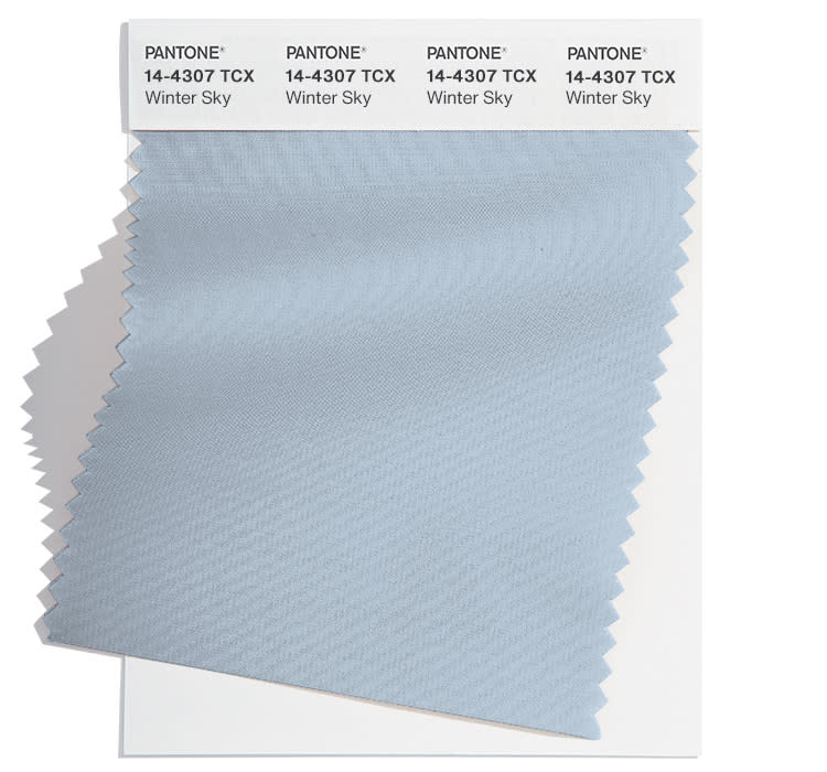
Winter Sky 14-4307: While a cooling blue hue is a surprise for fall, Winter Sky offers “clarification,” as does the next line, Lucent White. Both tones round out the top 10 with ease.
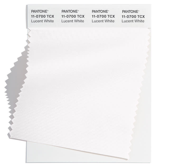
Lucent White 11-0700: The prominence of this “clarified” pure white doesn’t mean cream whites are going away, Eiseman said. A key piece in Donna Karan’s relaunched New York collection is a shirt in Lucent White. “What is happening is that there is an abundance of whites, which is strange to say the least.” As for whether the clarification’s emphasis implies that everything is destroyed or can be destroyed, Eiseman added, “That’s just right.”
New York Fashion Week Fall 2024 New Classic
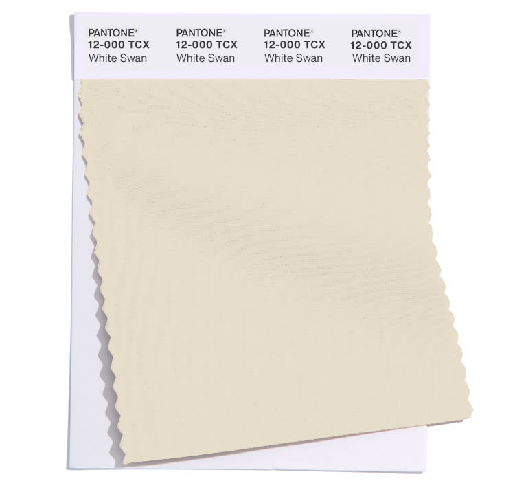
White Swan 12-000: Soft and downy, White Swan also signals the need for further clarification as the second white in the selection. But it’s warmer than Lucent White and takes the shade in a different direction, according to Eiseman. Boygenius’ Phoebe Bridgers, Julien Baker and Lucy Dacus collected their Grammys last weekend, wearing a Thom Browne White Swan dress. Zendaya and Bad Bunny got a jump on the trend, too, for key photo shoots.
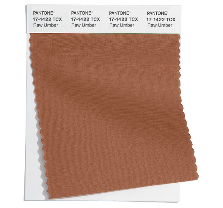
raw Cave 17-1422: This established brown is associated with the Earth, and designers are using it more than ever. Dapper Dan added a touch of Raw Umber to his just-released collaborative line with Gap.
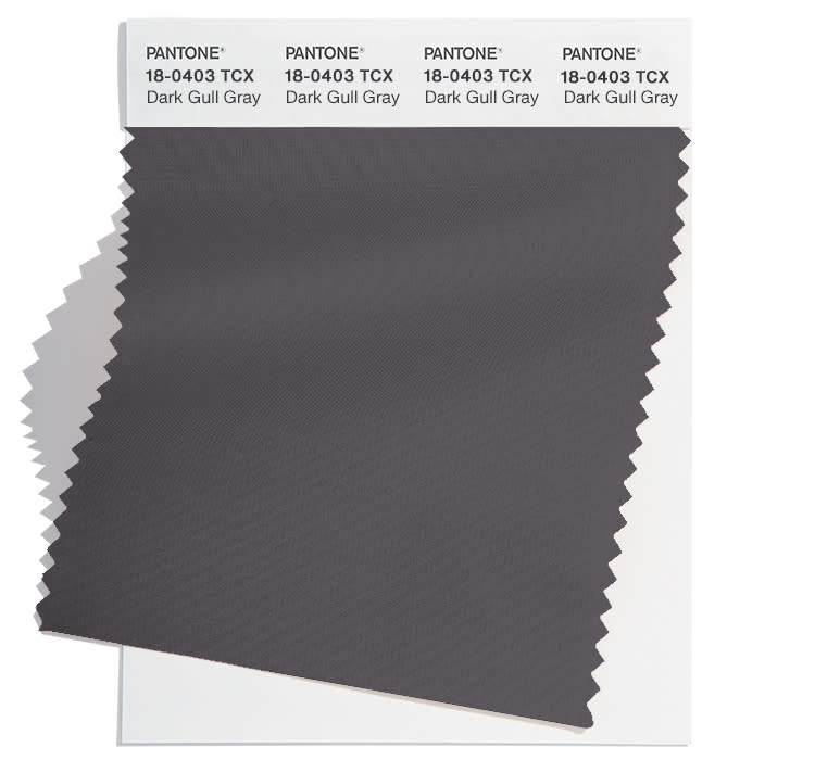
Gray Black Seagull 18-0403: Solid, dense and an offset to cooler shades, Dark Dull Gray provides a solid base just like Raw Umber does. It also translates well to evening, as proven by Tory Burch in Los Angeles this week.
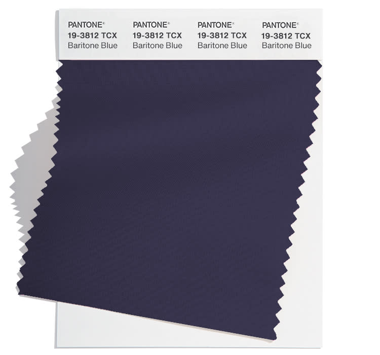
Blue Baritone 19-3812: This dark blue is one that Pantone has developed over the last few years and it hits just the right note. Blues tend to be subjective to many shoppers. The same could be said for designers including Dennis Basso for fall 2024. At the mention of “navy” most people conjure up varying degrees of dark blue, but Baritone Blue doesn’t make people think , ‘Oh, that’s just navy blue or another deep. blue,” said Eiseán.
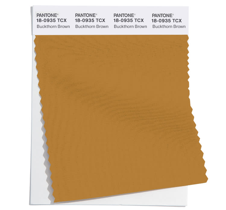
Buckhorn Brown 18-0935: However unusual it is to have two browns among the list of five core colors, the Pantone team felt that “brown was so important.” As the name suggests, Buckhorn Brown gives off a western vibe – another fashion trend – and one that was first pioneered by Ralph Lauren decades ago. Forecasting the interior of the home, Eiseman said, “That whole western vibe has become so strong that it’s called a classic cowboy name.” Until then, she highlighted how Beyoncé wore a white Stetson hat to a performance at the Grammys last weekend, she said.
The best of WWD